Search
Latest topics
» Mr. Q's PiggyBanksby Mr. Q Today at 4:55 am
» "The Fire Flower" Princess Hibana vs "The Gold Standard" Alaina Sanders?!
by HighFly Yesterday at 10:24 am
» Argos Penelope
by Mr. Q Yesterday at 6:58 am
» Leto Nikos (debut) vs. Saori Saito - Sarge's Orders
by Mr. Q Yesterday at 6:02 am
» Zebra Woman vs KIRA (Debut) - Just Business
by CrashTestDumbass Yesterday at 6:00 am
Who is online?
In total there are 505 users online :: 0 Registered, 0 Hidden and 505 Guests :: 3 BotsNone
Most users ever online was 736 on Thu Nov 07, 2024 10:12 pm
Champions & #1 contenders
Looking for my first match!
Wed Oct 16, 2024 8:32 pm by CaptainL
Hey there! Just got my first profile approved, and I'm ready to get started at AFW. Hit me up on Discord or DMs if you want to discuss things!
Comments: 0
Match request
Tue Sep 10, 2024 1:09 am by Nurin
Hai saya Nurin and I wish to have my first match here you can pick any of my girls (if you pick one of the hellhounds it will either be handicap or tag) for a match
https://www.afwrpg.com/t23085-nurin-s-girls#582172
https://www.afwrpg.com/t23085-nurin-s-girls#582172
Comments: 0
Femdom matches with smothers in mixed matches
Mon Jun 24, 2024 2:01 am by jdo_sss
If anyone has any female characters that needs more wins and uses moves like stinkface, breast smother etc let me know message me on discord thanks
NitroVitro
NitroVitro
Comments: 0
Community Feedback Please: Making Bio and Roster Changes.
+2
Harrier
Yori
6 posters
Page 1 of 2
Page 1 of 2 • 1, 2 
 Community Feedback Please: Making Bio and Roster Changes.
Over the years I've been here with this community, I've managed to amass quite the collection of characters. I take some measure of personal pride in my cast of ladies and gents diverse enough to fit into a wide range of situations, making me flexible to what I am able to do on the forums. My own personal bias not withstanding, it gives me the ability to work with just about anyone.
I try to freshen them up a bit now and then. Providing active updates to their bios ranging from pictures uploads, statistical tweeking based around roleplay, and keeping perhaps and overly meticulous archival of any threads they may be involved in in hopes of keeping things up to date and easily searched. A small but recent change for example is the inclusion of social media links to landing pages for characters that have them. My main roster page however hasn't seen much in the way of real revision since its inception. I've added a few graphics, included some quick links, and keep a pretty good update log for posterity sake.
I have been thinking about sprucing it up some more, my profiles as well, in the next coming months but I figured I should get some feedback. While it is of course my characters and roster, its primary function is to help other people navigate what I have going on so it only makes sense to me to reach out for other people's takes on what I currently have and changes I am thinking about and maybe even suggest some improvements to me. Open to constructive comments on any front.
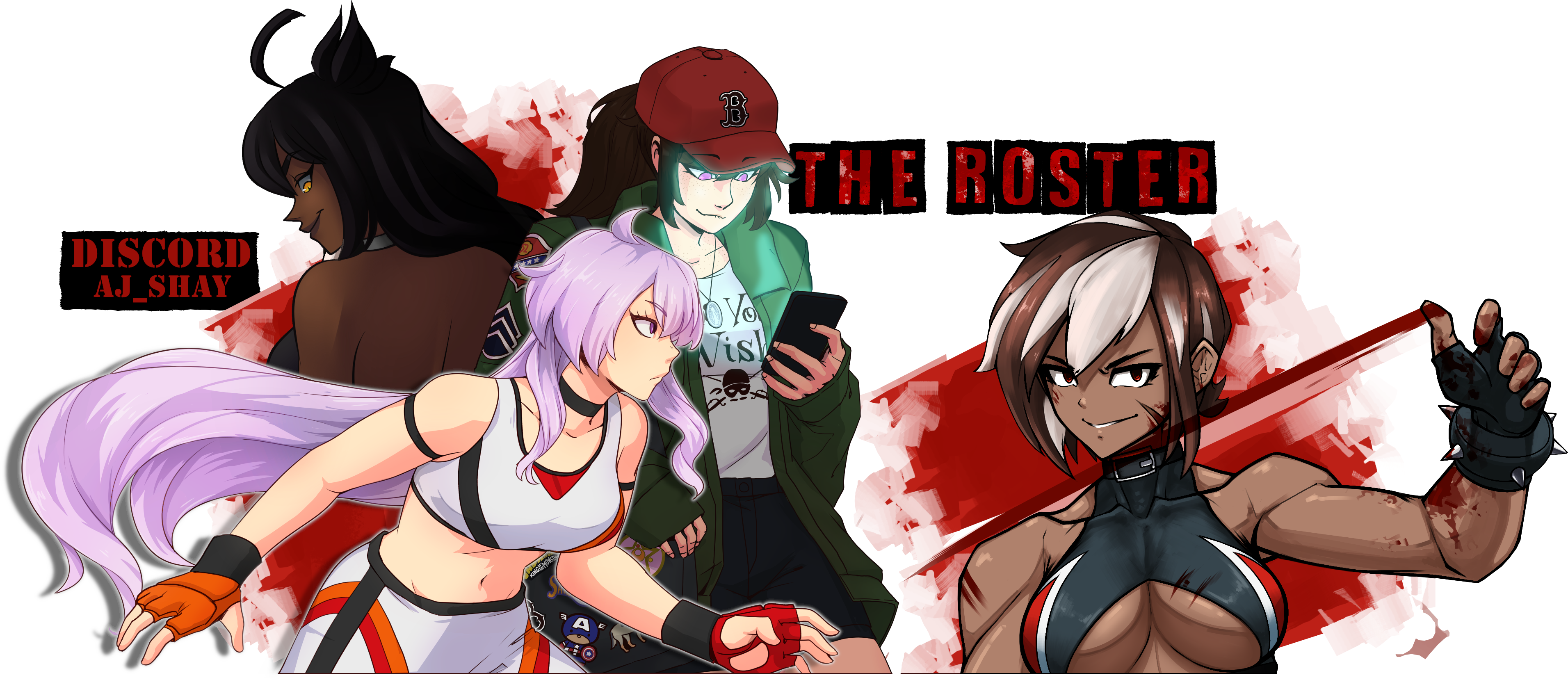
The Roster
I intend to keep the update log and author's notes (I may add some more of those)
I am debating removing the "Quick Select" spoiler tag, let me know if any of you find it useful enough to keep.
Right now on my roster page the setup is:
Possible changes I was considering were:
Thumbnail size:
I made them small originally just to be a small snippet, back when I only had a handful of characters that was fine. Now, I have a whole lot of them. While they are pretty diverse, that can be hard to tell at a glance. A while back I helped Tai rework his roster page with some graphics and it helped me appreciate how a slightly bigger image can show things off more without being intrusive. I am thinking about doing that and maybe adding a neat uniform border around them to make them pop a bit more than the small highlight/shadow thing I have now that makes them look like buttons. Right now they are 125x125px, the ones I made Tai are 250x250px. Was floating possibly settling at either 250px or 300px with the custom borders.
Visual indicators:
While a few people do this, I am going to use Acuyra as the example here, because he is a mod and because its the first one that popped into my head due to recent perusal. In his roster page rework he includes a "Threat Level" and "Hentai Level" which I think is very helpful for a visual aid. I'm considering adding something like that myself to provide better sight reading of what they can expect from a match with that character. I am toying with the idea of making it a bit more visually appealing with some graphics. Nothing super fancy, just some stylized bars or something. The concept is not 100% realized for me yet.
Condense flavor text:
The three lines may not seem like much, but boy does it sometimes feel very hard to write something unique there and not make it too wordy to break up the format. I'm thinking about axing the bulk of that to give it a more helpful context and take up less room. I will probably keep the "stinger" line to give a general "What is this character" line. In place of the other things, the two flavor line and the extra stuff, I was considering just adding a spoiler tag and filling it with some relevant info a potential threader might want without having to click. Things like face/heel status, their wrestling style, and possible suggested thread types for them. Including if they cross promote would be included here.
Organization:
The characters on my roster are not really in any particular order. Truth be told, I try to just not stick them next to another character that has the same color code for their flavor text/dialogue. I've always wanted to organize them a bit better but haven't had a solid way to go about doing that. I might tie this in with the "Threat Level" thing up above and order them from "weakest" to strongest based solely on that, per brand. Could also group Face/Tweener/Heels together. Not really sure though.
The Bios:
In regards to my bios themselves, I need to go back through all of them and fix some lingering typos. I still find some every so often and it's the band of my existence. Other than that, I wanted to add a small section under the primary personal character info that breaks down what the character is generally used for.
Edit: To clarify something that was mentioned to me about this, a character would have as many tags as would apply to them, not just a single one.
Examples being:
Underdog
Cheater
Seductress
Competitor
Monster
Vengeful
These would likely be found in a spoiler tag near where I post all the appearance stuff or in a separate post on the bio thread like how I archive my thread histories. The formatting would just be [Trait Name] "Brief description of what this means in context of threading." These would be tags I would use uniform across all my characters much like how I format my thread listings. Along with this, I would maybe add some suggestions of good dynamic pairings for the character since this is a practice I almost always find myself doing when booking threads.
I try to freshen them up a bit now and then. Providing active updates to their bios ranging from pictures uploads, statistical tweeking based around roleplay, and keeping perhaps and overly meticulous archival of any threads they may be involved in in hopes of keeping things up to date and easily searched. A small but recent change for example is the inclusion of social media links to landing pages for characters that have them. My main roster page however hasn't seen much in the way of real revision since its inception. I've added a few graphics, included some quick links, and keep a pretty good update log for posterity sake.
I have been thinking about sprucing it up some more, my profiles as well, in the next coming months but I figured I should get some feedback. While it is of course my characters and roster, its primary function is to help other people navigate what I have going on so it only makes sense to me to reach out for other people's takes on what I currently have and changes I am thinking about and maybe even suggest some improvements to me. Open to constructive comments on any front.
The Roster
I intend to keep the update log and author's notes (I may add some more of those)
I am debating removing the "Quick Select" spoiler tag, let me know if any of you find it useful enough to keep.
Right now on my roster page the setup is:
Thumbnail
Small stinger line relating to the character
Flavor line about character
Flavor line about their fighting style
Added info on cross brand stuff when applicable.
- Example:

Possible changes I was considering were:
Thumbnail size:
I made them small originally just to be a small snippet, back when I only had a handful of characters that was fine. Now, I have a whole lot of them. While they are pretty diverse, that can be hard to tell at a glance. A while back I helped Tai rework his roster page with some graphics and it helped me appreciate how a slightly bigger image can show things off more without being intrusive. I am thinking about doing that and maybe adding a neat uniform border around them to make them pop a bit more than the small highlight/shadow thing I have now that makes them look like buttons. Right now they are 125x125px, the ones I made Tai are 250x250px. Was floating possibly settling at either 250px or 300px with the custom borders.
- Example Sizes:


Visual indicators:
While a few people do this, I am going to use Acuyra as the example here, because he is a mod and because its the first one that popped into my head due to recent perusal. In his roster page rework he includes a "Threat Level" and "Hentai Level" which I think is very helpful for a visual aid. I'm considering adding something like that myself to provide better sight reading of what they can expect from a match with that character. I am toying with the idea of making it a bit more visually appealing with some graphics. Nothing super fancy, just some stylized bars or something. The concept is not 100% realized for me yet.
Condense flavor text:
The three lines may not seem like much, but boy does it sometimes feel very hard to write something unique there and not make it too wordy to break up the format. I'm thinking about axing the bulk of that to give it a more helpful context and take up less room. I will probably keep the "stinger" line to give a general "What is this character" line. In place of the other things, the two flavor line and the extra stuff, I was considering just adding a spoiler tag and filling it with some relevant info a potential threader might want without having to click. Things like face/heel status, their wrestling style, and possible suggested thread types for them. Including if they cross promote would be included here.
Organization:
The characters on my roster are not really in any particular order. Truth be told, I try to just not stick them next to another character that has the same color code for their flavor text/dialogue. I've always wanted to organize them a bit better but haven't had a solid way to go about doing that. I might tie this in with the "Threat Level" thing up above and order them from "weakest" to strongest based solely on that, per brand. Could also group Face/Tweener/Heels together. Not really sure though.
The Bios:
In regards to my bios themselves, I need to go back through all of them and fix some lingering typos. I still find some every so often and it's the band of my existence. Other than that, I wanted to add a small section under the primary personal character info that breaks down what the character is generally used for.
Edit: To clarify something that was mentioned to me about this, a character would have as many tags as would apply to them, not just a single one.
Examples being:
Underdog
Cheater
Seductress
Competitor
Monster
Vengeful
These would likely be found in a spoiler tag near where I post all the appearance stuff or in a separate post on the bio thread like how I archive my thread histories. The formatting would just be [Trait Name] "Brief description of what this means in context of threading." These would be tags I would use uniform across all my characters much like how I format my thread listings. Along with this, I would maybe add some suggestions of good dynamic pairings for the character since this is a practice I almost always find myself doing when booking threads.

Yori- Posts : 5194
Join date : 2017-11-19
 Re: Community Feedback Please: Making Bio and Roster Changes.
I keep characters in my sig in chronological order for nostalgia reasons. Grouping them has also come to mind, but I guess this has been replaced by the Win to Loss ratio in my case.
What I always find useful in profiles is the section where it is stated what the character is vailable for and what not. I guess I am not a very visual person because I only find little use in finding many pictures because I feel that is a lot of work for little effort and with danger of violating artists rights. And with me being cheap and lazy of course .
.
I also have some red flags. The character is an obvious Psycho? Pass. Hardcore sadist? Pass.
Useful would also be a special idea what could be possible with the character. Kind of like with a blog post.
Edit: Tags seem like a good idea to me.
What I always find useful in profiles is the section where it is stated what the character is vailable for and what not. I guess I am not a very visual person because I only find little use in finding many pictures because I feel that is a lot of work for little effort and with danger of violating artists rights. And with me being cheap and lazy of course
I also have some red flags. The character is an obvious Psycho? Pass. Hardcore sadist? Pass.
Useful would also be a special idea what could be possible with the character. Kind of like with a blog post.
Edit: Tags seem like a good idea to me.
_________________
Friction:
Tessa "Harrier" Price
Barb Wire(Tag Team)
Kelly "Pony" Flowers(Kawaii)
Anja the Raven
Amaya the Maiko(Kawaii)
Senior Officer Ise
Gina "the Brat" Lees
Blog:
Blog and Flock

Harrier- Posts : 7087
Join date : 2011-11-16
 Re: Community Feedback Please: Making Bio and Roster Changes.
I definitely think that organizing your roster in some fashion might be a good idea - I like the idea of grouping them. I think in order from weakest to strongest makes the most sense, makes it quick to figure out what I should be looking for when perusing - if I want a character that's tough, I should look towards the bottom, et cetera. Though that could get tough when it comes to characters who are good at certain match types and not others...
I like the idea of a recommended match, though I worry about having too much stuff on each profile - you don't want clutter, of course.
Idea! Maybe include WLD ratio, too. It'd be a quick way for anyone to get a grip on how much you use said character and how often they loose, how big a threat they are, stuff like that.
_________________


acuyra- Posts : 19142
Join date : 2014-02-14
Age : 38
Location : Charlotte, North Carolina, WOOOO!
 Re: Community Feedback Please: Making Bio and Roster Changes.
acuyra wrote:Idea! Maybe include WLD ratio, too. It'd be a quick way for anyone to get a grip on how much you use said character and how often they loose, how big a threat they are, stuff like that.
Not a bad suggestion, but I think that a WLD ratio might not tell the whole story, especially if a character changes overtime. Numbers can be deceiving, at times. That and it could make other RPers think that they pretty much care about their Win/Loss record, with wins being intrinsically linked to the characters drawing power, rather than being open tell a better and compelling story.
BritBrat- Posts : 2222
Join date : 2017-07-11
Age : 94
Location : Planet Earth
 Re: Community Feedback Please: Making Bio and Roster Changes.
BritBrat wrote:
Not a bad suggestion, but I think that a WLD ratio might not tell the whole story, especially if a character changes overtime. Numbers can be deceiving, at times. That and it could make other RPers think that they pretty much care about their Win/Loss record, with wins being intrinsically linked to the characters drawing power, rather than being open tell a better and compelling story.
I agree to a degree. But a WDL can also show that you are willing to take loses with certain or even all characters. I personaly would also feel a character is kind of static if there is no W/L/D if you do not write a chronological timeline instead, whch seems more work for me. In the wake of this idea I also thought of aging the characters accordingly, but I fell back on the idea that the timeline doesn´t have to be the same as in most anime series.
_________________
Friction:
Tessa "Harrier" Price
Barb Wire(Tag Team)
Kelly "Pony" Flowers(Kawaii)
Anja the Raven
Amaya the Maiko(Kawaii)
Senior Officer Ise
Gina "the Brat" Lees
Blog:
Blog and Flock

Harrier- Posts : 7087
Join date : 2011-11-16
 Re: Community Feedback Please: Making Bio and Roster Changes.
In regards to the win loss ratio idea, I had hoped to use the trait tags things as a simplistic way to help with that by pointing out if they are booked in a certain way or are currently being pushed since it's something that can change with time.
I feel putting an emphasis on wins and losses directly sends the wrong message and sets up the idea like Brit mentioned, that it's something that really matters. While not my character, Killcarrion's Dasher is a good example for this. His undefeated streak in singles competition (against ladies) is a big deal for his character. While winning another match doesn't really do anything to develop him on a personal level past bragging rights, it builds him up for that day he might finally be defeated to make it a huge deal. That adds value to the story with the stakes involved. Winning for winning same doesn't mean anything in roleplay just because it's about telling a story with someone not being better or worse than them.
I am still struggling with the organizing thing really. I have some characters that I consider to be my more prominent ones that I would like to use more, but in many cases they aren't my more "powerful" characters. AJ for example is someone I still consider to be my main gal in Friction and I out a ton of effort into building her story. On the surface she is just a competitive jobber for the most part so if I had them set up by strength/threat she'd be at the bottom with a character like Ari who, to be frank, is a plug and play character that doesn't receive or need any real development.
I am really thinking about going in on breaking them up via brand and alignment as a way to make them manageable to find but still semi organized without losing any one character in the shuffle. The only awkward bit I can think of with that is how it can potentially split up my tag teams on the roster listing when they are listed individually.

Yori- Posts : 5194
Join date : 2017-11-19
 Re: Community Feedback Please: Making Bio and Roster Changes.
Yori wrote:I am still struggling with the organizing thing really. I have some characters that I consider to be my more prominent ones that I would like to use more, but in many cases they aren't my more "powerful" characters. AJ for example is someone I still consider to be my main gal in Friction and I out a ton of effort into building her story. On the surface she is just a competitive jobber for the most part so if I had them set up by strength/threat she'd be at the bottom with a character like Ari who, to be frank, is a plug and play character that doesn't receive or need any real development.
I am really thinking about going in on breaking them up via brand and alignment as a way to make them manageable to find but still semi organized without losing any one character in the shuffle. The only awkward bit I can think of with that is how it can potentially split up my tag teams on the roster listing when they are listed individually.
Kelsea has a visual indicator of his own that shows his desire to write a character, perhaps that could be a way to show which one you're most willing to get into matches for. Iceman does something similar where he'd put certain characters in the forefront and if there are others that are less needed for threads, have them put lower down in another section. Just to spotlight the kind of characters you want to focus on the most and that helps others to come with ideas for potential matches/storylines.
BritBrat- Posts : 2222
Join date : 2017-07-11
Age : 94
Location : Planet Earth
 Re: Community Feedback Please: Making Bio and Roster Changes.
That's certainly one way I could go. I'm not sure how useful it would be in my case though only because if a character isn't on my shelf section, I do genuinely want to use them. Sometimes it can be a lucky situation in which they can only be used in a certain way or with certain setups. Even if I am not feeling a particular character, the right ideas or inspiration can turn that around pretty fast.

Yori- Posts : 5194
Join date : 2017-11-19
 Re: Community Feedback Please: Making Bio and Roster Changes.
Wellz...I personally think you should keep the quick select tags since I feel like it can serve to accomplish numerous methods of categorizing your roster. Maybe you can separate those quick select avatars into heel/babyface/tweener sections, and by descending order they can be arranged by skill level. So jobbers at the bottom and talented peeps at the top, or from left to right instead to conserve space. So that would be two layers of organizing at once. From here you could ostensibly either keep the following links listed below with their flavor text and include pertinent information you mentioned, like wrestling style, suggested thread types for them, cross promotion availability etc...or daresay do away with that elongated list and make the quick select your main hub of selection and include all of that pertinent information in their profiles and visible as soon as you click on them. But that would be up to you and you alone.
It's a ponderous quandary because a roster as robust as your own has multiple venues to categorize them and I could probably write on forever about this despite my roster not being that fantastically organized, but as a start I honestly think organizing the quick select is one way of streamlining the perusal process.
It's a ponderous quandary because a roster as robust as your own has multiple venues to categorize them and I could probably write on forever about this despite my roster not being that fantastically organized, but as a start I honestly think organizing the quick select is one way of streamlining the perusal process.

killcarrion- Posts : 6269
Join date : 2013-04-14
Age : 37
 Re: Community Feedback Please: Making Bio and Roster Changes.
I definitely don't think I am going to water down my main roster page to just the quick select just because I want the roster page to give people an idea of what they will get before having to look at the profiles. I'm not a news site, I don't get paid on clicks, yaknow?
Organizing it sounds good though, better than the cloud of faces it is now. I will probably break it down by gender and alignment for ease of viewing and I am leaning to keeping the main roster page sectioned by brand and alignment. Still pickling over if there should be a ordering of them within each category, but I need to visualize the actual split before I can see what will work for sure.
Very great feedback so far from everyone, keep it coming! This is very helpful.

Yori- Posts : 5194
Join date : 2017-11-19
Page 1 of 2 • 1, 2 
 Similar topics
» Feedback
» News. Points. Feedback. Ideas?
» About the roster
» New! Tag Team Roster!
» Valicon's Roster
» News. Points. Feedback. Ideas?
» About the roster
» New! Tag Team Roster!
» Valicon's Roster
Page 1 of 2
Permissions in this forum:
You cannot reply to topics in this forum
 Events